pacman::p_load(rtweet, tidyverse, ggplot2, utils, tm, SnowballC, caTools,
               rpart, topicmodels, tidytext, wordcloud, lexicon, reshape2,
               sentimentr)
NEWS
With the next Twitter regulations, The free package comes with rate-limited access to v2 tweet posting and media upload endpoints, with a posting limit of 1,500 tweets per month at the app level. If you want to access to posting tweets are up to 3,000 per month, and for reading, it’s up to 10,000 tweets per month, you will need to pay 100 USD per month. However, you can sill acces to databases and use this tutorial to analyze text in general.
Introduction
Social media has become an important source of information and communication for individuals, businesses, and organizations; actually there is a growing need to analyze social media data to gain insights into user behavior, sentiment, and trends. With the NLP trend and other inputs, Social media scraping, which involves collecting and analyzing data from social media sites, such as Twitter, has emerged as a powerful tool for such analysis.
In this introduction, we will explore the basics of social media scraping using R and Twitter, including how to access the Twitter API, retrieve data from Twitter, and perform basic analyses on the data. We will also discuss some of the ethical and legal considerations of social media scraping, and provide tips for using social media scraping responsibly.
Scraping Tweets
We’ll be make two datasets: one containing tweets just from US President Biden’s Twitter account and the other scraping the most recent (English language) tweets from all Twitter accounts mentioning the word “green.”
biden_tweets <- read_csv("https://raw.githubusercontent.com/lukaslehmann-R/common_files/main/biden_tweets.csv")
green <- read_csv("https://raw.githubusercontent.com/lukaslehmann-R/common_files/main/green.csv")
Here are the Biden tweets. We show the first 6 entries of the biden_tweets database
created_at <dttm> | id <dbl> | id_str <dbl> | |
|---|---|---|---|
| 2023-03-17 03:14:37 | 1.636567e+18 | 1.636567e+18 | |
| 2023-03-17 01:00:49 | 1.636533e+18 | 1.636533e+18 | |
| 2023-03-16 21:47:02 | 1.636484e+18 | 1.636484e+18 | |
| 2023-03-16 19:45:00 | 1.636454e+18 | 1.636454e+18 | |
| 2023-03-16 19:22:47 | 1.636448e+18 | 1.636448e+18 | |
| 2023-03-16 16:34:03 | 1.636405e+18 | 1.636405e+18 |
And here are the databases with words related to green. The green database.
created_at <dttm> | id <dbl> | id_str <dbl> | |
|---|---|---|---|
| 2023-03-15 14:16:36 | 1.636008e+18 | 1.636008e+18 | |
| 2023-03-15 22:27:10 | 1.636132e+18 | 1.636132e+18 | |
| 2023-03-16 11:10:44 | 1.636324e+18 | 1.636324e+18 | |
| 2023-03-17 01:09:24 | 1.636535e+18 | 1.636535e+18 | |
| 2023-03-17 01:09:23 | 1.636535e+18 | 1.636535e+18 | |
| 2023-03-17 01:09:22 | 1.636535e+18 | 1.636535e+18 |
I turned the first two lines into comments for the same reason as earlier. The third and fourth lines will load in the same datasets (although the data within will different because Biden and other Twitter users will continue to tweet)
Frequency of Biden tweets
Now that we have our tweets, let’s construct a time series plot that shows the frequency of tweets by President Joe Biden over time. The data is aggregated using two-week intervals. The plot displays the number of tweets on the y-axis and time on the x-axis. Each point on the plot represents the number of tweets for a particular two-week interval.
Code
# Create time series plot using ts_plot() function from tsbox package
# "2 weeks" specifies the interval for aggregating the data
biden_tweets %>% ts_plot("2 weeks") +
# Customize plot appearance using ggplot2 functions
ggplot2::theme_minimal(base_size=16) +  # remove background gridlines and borders
ggplot2::theme(plot.title = ggplot2::element_text(face = "bold")) +  # set plot title to boldface font
ggplot2::labs(x = NULL, y = "Number of Tweets",  # set labels for x and y axis
     title = "Frequency of Biden tweets",  # set plot title
     subtitle = "Tweet counts aggregated using two-week intervals",  # set plot subtitle
     caption = "\nSource: Data collected from Twitter's REST API via rtweet") +  # set plot caption
geom_point(size=6) + # add points to plot to show tweet count at each interval
geom_line(linewidth=1.5)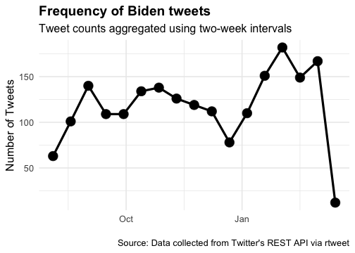
Topic Modeling
There’s a lot that goes into explaining what a topic model is. One kind of topic model is called LDA, and you can read all about it here
Corpus
In natural language processing (NLP), a corpus is a collection of written or spoken language that is used as a basis for analysis. A corpus can be made up of many different types of texts, including books, articles, speeches, social media posts, and more. Here, we will make a corpus of documents using just the full_text part of green tweets
corpus1 <- Corpus(VectorSource(green$full_text))Now we need to clean our text a bit. Change to lower case and remove punctuation!
corpus1 <- tm_map(corpus1, tolower)
corpus1 <- tm_map(corpus1, removePunctuation)
#We need to remove stop words to get meaningful results from this exercise.
#We'll remove words like "me", "is", "was"
stopwords("english")[1:50]
[1] "i" "me" "my" "myself" "we"
[6] "our" "ours" "ourselves" "you" "your"
[11] "yours" "yourself" "yourselves" "he" "him"
[16] "his" "himself" "she" "her" "hers"
[21] "herself" "it" "its" "itself" "they"
[26] "them" "their" "theirs" "themselves" "what"
[31] "which" "who" "whom" "this" "that"
[36] "these" "those" "am" "is" "are"
[41] "was" "were" "be" "been" "being"
[46] "have" "has" "had" "having" "do" corpus1 <- tm_map(corpus1, removeWords, (stopwords("english")))
#We need to clean the words in the corpus further by "stemming" words
#A word like "understand" and "understands" will both become "understand"
corpus1 <- tm_map(corpus1, stemDocument)
Document Term Matrix
So, a DTM is a way of representing a collection of text documents quantitativelythat allows us to do some cool stuff with them. It’s basically a matrix where the rows correspond to the documents in the collection, and the columns correspond to the unique words or terms that appear in the documents. Each cell in the matrix represents the frequency of a particular term in a particular document.
#creates a document term matrix, which is necessary for building a topic model
DTM1 <- DocumentTermMatrix(corpus1)
#Here we can see the most frequently used terms
frequent_ge_20 <- findFreqTerms(DTM1, lowfreq = 100)
frequent_ge_20
[1] "amp" "green" "like" "store" "day" "…"
[7] "’s" "light" "one" "year" "figur" "red"
[13] "buddha" "fasc1nat" "four" "f…" "philippin" "pray"
[19] "purchas" "spent" "woman"
Let’s create the topic model! We’ll start with 5 topics
The code snippet performs topic modeling on a corpus of text data represented as a Document-Term Matrix (DTM) using the Latent Dirichlet Allocation (LDA) algorithm. The LDA() function from the topic models package is used to create a model with 7 topics and a specified random seed for reproducibility. The resulting model is stored in the green_lda1 object.
#Perform LDA topic modeling on a Document-Term Matrix (DTM) with 7 topics
green_lda1 <- LDA(DTM1, k = 7, control = list(seed = 1234))

#Print the model summary
green_lda1
A LDA_VEM topic model with 7 topics.#Convert the model's beta matrix to a tidy format
green_topics1 <- tidy(green_lda1, matrix = "beta")
green_top_terms1 <- green_topics1 %>%
group_by(topic) %>% #Group the terms by topic
slice_max(beta, n = 10) %>% #Top 10 terms with the highest probabilities
ungroup() %>% #Remove the grouping attribute from the data frame
arrange(topic, -beta) #Sort the data frame by topic index and term probability
Top 10 Terms by Topic
Code
library(ggplot2)
library(tidytext)
library(ggtext)

#Reorder the terms within each topic based on their probability (beta) values
green_top_terms1 %>%
  mutate(term = reorder_within(term, beta, topic)) %>%
#Create a bar plot of the term probabilities for each topic
  ggplot(aes(beta, term, fill = factor(topic))) +
  geom_col(show.legend = FALSE, width = 0.8) +
  scale_fill_manual(values = c("#1f77b4", "#ff7f0e", "#2ca02c", "#d62728", "#9467bd", "#8c564b", "#e377c2")) +
  theme_minimal()+
#Create separate plots for each topic and adjust the y-axis limits for each plot
  facet_wrap(~ topic, scales = "free", ncol = 2, strip.position = "bottom") +
  theme(strip.background = element_blank(),
        strip.text = element_text(size = 12, face = "bold")) +
#Apply a custom scale for the y-axis that preserves the within-topic ordering of terms
  scale_y_reordered(expand = c(0, 0)) +
  labs(title = "Top 10 Terms by Topic",
       x = "Term Probability",
       y = NULL,
       caption = "Source: LDA Topic Model of Green Energy Tweets")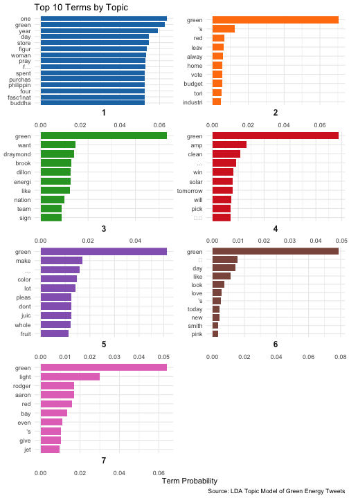
The plot is a bar chart showing the top 10 terms for each of the 7 topics generated by an LDA topic modeling algorithm. Each topic is represented by a different color, and the bars are sorted in descending order of probability (beta) within each topic. The x-axis shows the probability (beta) of each term being associated with the topic, ranging from 0 at the left side of the plot to 0.05 at the right side of the plot. The y-axis shows the top 10 terms for each topic, with each topic in a separate facet of the plot.
Overall, the plot allows us to see which terms are most strongly associated with each of the 7 topics. For example, we can see that for topic 1 (represented by blue bars), the most strongly associated terms are “climate”, “change”, “renewable”, and “energy”, while for topic 5 (represented by purple bars), the most strongly associated terms are “carbon”, “footprint”, and “reduction”.
Word Cloud
Now let’s go back to the Biden tweets and make a word cloud. What’s a word cloud? A word cloud is a graphical representation of textual data in which the size of each word represents its frequency or importance. It’s a popular visualization tool in data analysis and is often used to quickly identify the most common words in a text or group of texts. You can read about it in detail here
words_data <- biden_tweets %>%
  select(text)%>%
  unnest_tokens(word, text)
#Let's get rid of some words associated with links and things that cause errors
words_data <- words_data %>%
  filter(!word %in% c('https', 't.co', 'he\'s', 'i\'m', 'it\'s'))
#Let's get rid of stopwords
words_data2 <- words_data %>%
  anti_join(stop_words) %>%
  count(word, sort = TRUE)
Word Cloud of Biden Tweets
Code
# Create custom color palette
my_palette <- brewer.pal(8, "Dark2")

# Create word cloud with larger font size and custom layout
wordcloud(words_data2$word,
          words_data2$n,
          max.words = 200,
          colors = my_palette,
          scale = c(5, 0.3),
          random.order = FALSE,
          rot.per = 0.25,
          random.color = TRUE,
          main = "Word Cloud of Biden Tweets")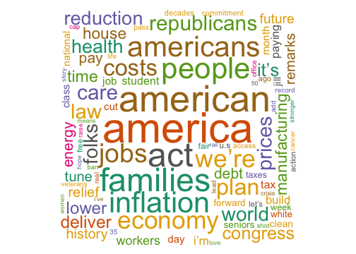
Comparison Cloud of Biden Tweets by Sentiment
Now let’s make a word cloud from those tweets but highlight which words are positive and which are negative
#Select and tokenize words
words_data <- biden_tweets %>%
  select(text) %>%
  unnest_tokens(word, text)

#Get sentiment scores for each word using the bing lexicon
sentiment_scores <- words_data2 %>%
  inner_join(get_sentiments("bing"))

#Count the number of words in each sentiment category
sentiment_counts <- sentiment_scores %>%
  count(sentiment, sort = TRUE)

#Create a list of profanity words to remove from the dataset
profanity_list <- unique(tolower(lexicon::profanity_alvarez))

#Filter out stop words and profanity words from the dataset
filtered_words_data <- words_data %>%
  filter(!word %in% c('https', 't.co', 'he\'s', 'i\'m', 'it\'s', profanity_list))

#Get sentiment scores for each filtered word using the bing lexicon
filtered_sentiment_scores <- filtered_words_data %>%
  inner_join(get_sentiments("bing"))
Cloud
Code
#Count the number of filtered words with each sentiment score
word_sentiment_counts <- filtered_sentiment_scores %>%
  count(word, sentiment, sort = TRUE) %>%
  acast(word ~ sentiment, value.var = "n", fill = 0)

#Create a comparison cloud using the word and sentiment counts
comparison.cloud(word_sentiment_counts,
                  colors = c("red", "blue"),
                  max.words = Inf)
Sentiment Analysis
Now we are going to see how many of President Biden’s tweets can be classified as positive, neutral, and negative. sentimentr is the main package in use here. The code snippet provided takes the tweets from Biden’s Twitter account and extracts individual sentences from each tweet. It then calculates the sentiment score for each sentence using the sentiment(), which uses a lexicon of positive and negative words to score each sentence as positive or negative. The sentiment scores for each sentence are then aggregated to obtain the mean sentiment score for each tweet. Based on these mean scores, the code then calculates the number of tweets that are positive, negative, or neutral in sentiment.
tweet_sentences_data <- sentiment(get_sentences(biden_tweets$text)) %>%
  group_by(element_id) %>%
  summarize(meanSentiment = mean(sentiment))

# Objects representing the number of positive, neutral,
#and negative tweets from President Biden
negative_t <- sum(tweet_sentences_data$meanSentiment < 0)
neutral_t <- sum(tweet_sentences_data$meanSentiment == 0)
positive_t <- sum(tweet_sentences_data$meanSentiment > 0)

# Creating vectors for a dataframe
type_tweet <- c("Negative", "Neutral", "Positive")
values <- c(negative_t, neutral_t, positive_t)
df_sentiment <- data.frame(type_tweet, values)
Sentiment Analysis of Biden’s Tweets
Finally, the results are visualized in a bar chart using the ggplot2 package.
Code
custom_palette <- c("#FF6361","#9B9B9B", "#00A693")

ggplot(data = df_sentiment, aes(x = type_tweet, y = values, fill = type_tweet)) +
  geom_col(width = 0.7, position = "dodge") +
  scale_fill_manual(values = custom_palette) +
  labs(title = "Sentiment Analysis of Biden's Tweets", x = NULL, y = "Number of Tweets") +
  theme_minimal(base_size = 16) +
  theme(plot.title = element_text(face = "bold", size = 20),
        axis.title = element_text(size = 18),
        axis.text = element_text(size = 14),
        legend.position = "none",
        panel.grid.major.y = element_line(color = "gray80"),
        panel.grid.minor = element_blank())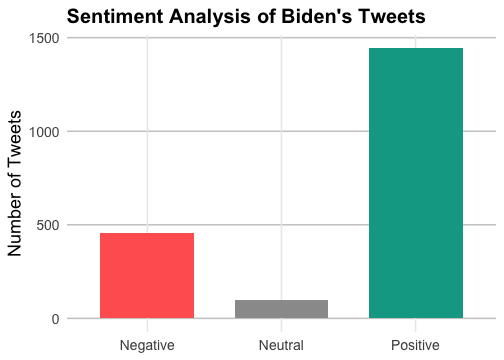
Conclusion
In conclusion, social media scraping using R and Twitter is a powerful method for collecting and analyzing data from Twitter. The rtweet package in R provides a convenient and efficient way to access Twitter’s REST API and retrieve large amounts of data, such as tweets, retweets, and user information.Using R and rtweet, researchers and data analysts can perform a wide range of analyses on Twitter data, including sentiment analysis, network analysis, and time series analysis. These analyses can provide insights into user behavior, sentiment, and trends on Twitter, which can be useful for a variety of applications, such as market research, political analysis, and social media monitoring.
References
Note
Cite this page: Lehmann, L. (2023, April 18). Introduction to Social Media Scraping. Hertie Coding Club. URL